Inspiration for Your Next Logo
Logos are some of the most iconic (pun intended) images in the world. They can represent not only a company or product, but also an idea and experience. The purpose of a logo is to capture the eye, be memorable, and clearly represent the intention behind the design. Logos can make or break a brand, so performing careful research and gathering inspiration before sitting down to create is crucial.
Typeface
A typeface is one of the simplest places to begin when designing a logo. Beautiful lettering always makes a great impression and experimenting with font families can help determine what feels right for your brand. A bold serif font provides a more traditional look, where a slender sans serif plays into current, modern trends.


Minimal
Sometimes you can hit big if you start small and a minimally designed logo can be the perfect exemplar. The logos below make minor adjustments or use a few lines to illustrate their message. If you have a big idea, distill it down to its plainest form, then start playing with a shape or two and see what you can think of.


Negative Space
Negative space (also known as “white” or “open” space) is an essential principle of design and, when used strategically, can create visually interesting images and engage an audience. Manipulating negative space can be as simple as taking away or adding a little in parts of your design. The logos below communicate clearly while making smart changes to the original idea.


Clever Placement
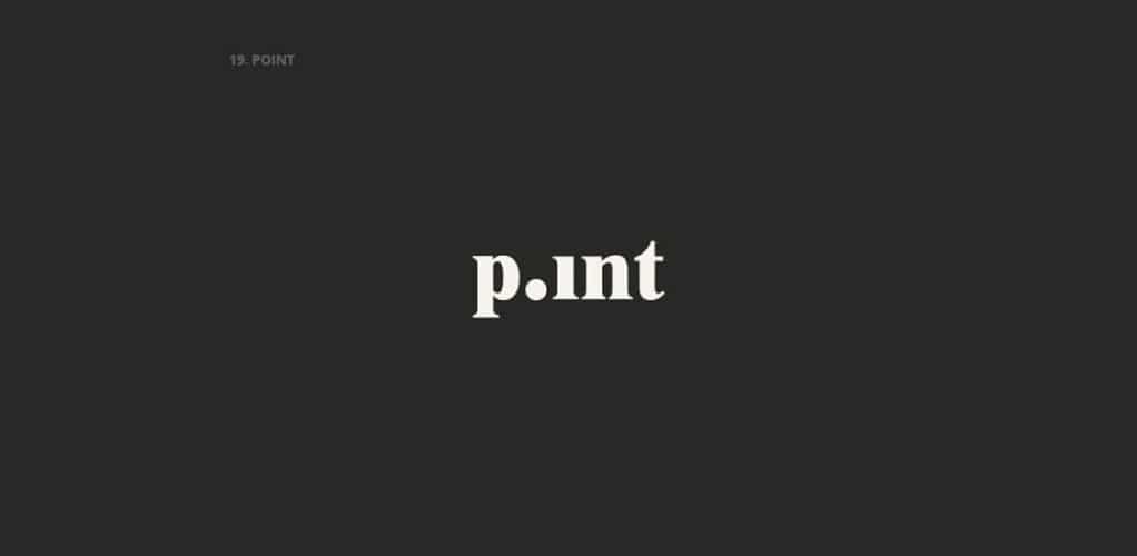
Similar to using negative space, “clever placement” is about taking what already exists and making it stand out. The following examples use the original name, some rearranging, and simple graphics to deliver a clear message.

Traditional
Designers throughout the early 1900’s used a combination of elegant type and intricate detail in order to create striking labels and logos; some are still iconic today. Traditional styling can vary based on inspiration and can take on modern adaptations, but should always work toward authenticity. You want your logo to be the clear voice of your brand, not a poor imitation of another.


Obvious
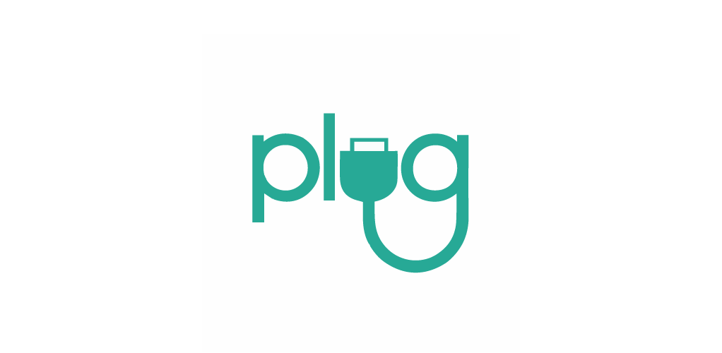
“Obvious” may not be the best descriptor for these logos, but take a look and you’ll get a better idea. The artists merely illustrate the name of the brand. Think of elements that relate to your brand’s name and function; sketch or look up as many as possible, then arrange those elements until you begin to see an idea that speaks to you. Starting with the most obvious iteration of a logo may leave you pleasantly surprised.
We hope this list of examples provides you with some inspiration. Good logo work is never easy and takes lots of trial and error before getting it right. Keeping that in mind, don’t worry if your early work is rough or nothing like you imagined. The more time and effort you put in, the more it will show in the end product. And maybe, with some luck, it might just live on forever.


