Psychology of Design: Shaping Your Online Image
We covered the importance of color thoroughly in the previous two installments of our psychology of design series. Color choice, however, is just one part of the struggle against bad design.
Whether you’re creating a background pattern for a new web design or you’re ideating about a new product’s packaging, eventually you’re going to have to put pencil to paper and start sketching. No matter what shape you start forming, it’ll have a powerful effect on your viewers.
Read on to learn more about the common associations your customers will make between the shapes you choose and what they say about your overall brand. Plus, see some real-world examples of how these shapes have been used in designs of all kinds!
Straight and Curved Lines
When it comes to line work, you’re really going to have to tow the line between angular and curvaceous. Lines may be the base shape that begets all artwork, but logos and web designs that rely heavily on linework are anything but simple.
Typically, humans have a preference for curved lines over straight lines. This can be attributed to the neurophysiology of the visual system. Even infants whose eyes are not fully formed will focus their attention longer on curved shapes than on sharp, angular lines.
However, curves won’t necessarily increase the amount of time a user will focus their attention on your design. In fact, sharp angles are more likely to catch the quick attention of your users. Where curves connote softness and complexity, sharp lines and angles connote seriousness and simplicity.
Studies have shown that angular objects can trigger a sense of threat. Sharpness in shapes has been shown to increase activity in the amygdala, which is the area of the brain that processes fear. For that reason, sharp angles often demand your audience’s attention and draw the eye in more quickly than their curved counterparts.
You can use these natural human response patterns to create designs that make your audience feel something. For fun, lighthearted brands, curved lines can help you break up blocks of text on sites and create a sense of whimsy. For more serious brand personas, though, sharp angles and straight lines will help drive home a sense of gravity.
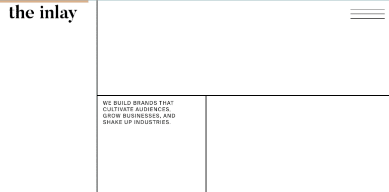
Creative studio The Inlay uses straight lines and a minimalist design to draw your eye as you scroll through the pages, but avoids overusing the sharp angles that may trigger negative responses.
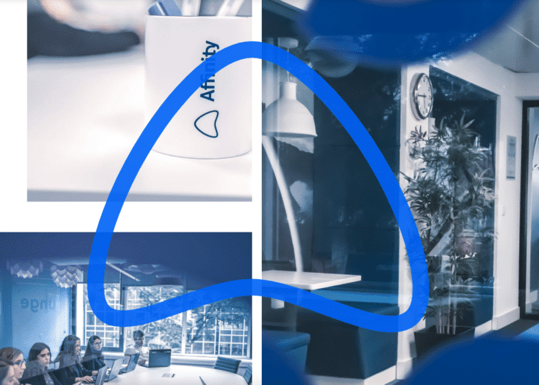
Technology consulting company Affinity, however, uses a lot of relationship-oriented language throughout their website. Their rounded arrow logo and curved shapes throughout the design feel much more approachable than the traditional, stiffer imagery used in the tech space.
Circles and Ovals
If you’re calling someone a square, you’re probably insinuating that they’re boring. The opposite, then, would mean that circles connote fun, youth, and a carefree mentality. It makes sense that because babies’ attention has been shown to hold longer for curved lines, they also tend to prefer circular toys.
Openness and togetherness come to mind when your viewers look at a circle. Round shapes can also connote feelings of community or protection—like being safe in your own bubble or even a nice hug. Other characteristics of circles can include friendship, warmth, femininity, and rebirth (think: the circle of life).
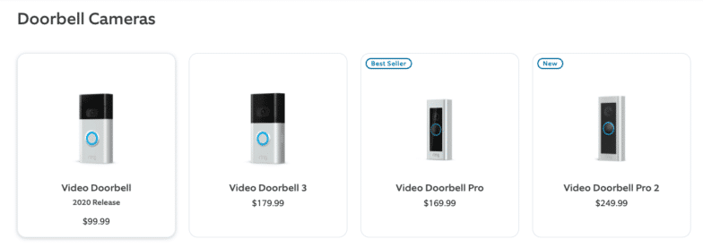
From a naming perspective, the Ring doorbell has tapped into their users’ senses. Auditorily, you can imagine the doorbell “ring” while visually, the imagined “ring” is tied to both their logo and the way the physical hardware is designed.
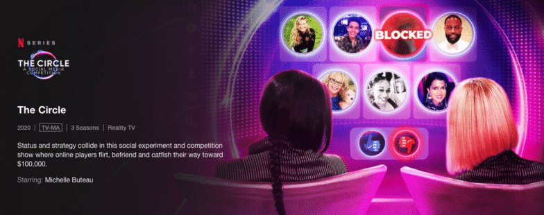
The Circle, a Netflix reality competition show, is another place in which circular branding makes the most sense. The premise is a group of people who may or may not be telling the truth about their identity try to gain popularity amongst their peers only through a social media platform called The Circle. The objective? Stay within the community—remain in The Circle.
Triangles
Acceleration, motion, and balance, triangles easily illustrate activity. They’re energetic, powerful shapes that can evoke an array of emotions from excitement to caution.
Triangles have impact, and the way they’re directed is crucial, because direction will change their meaning in the mind of your consumer. For example, a triangle pointing upward can show strength, but when turned even slightly askew, they can show instability. But multiple triangles in all different directions can demonstrate amusement or excitement—like confetti!
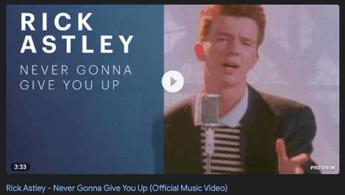
The play button on your favorite video or music streaming service is more than likely just a triangle pointing to the right. It resembles an arrow which indicates forward motion, as opposed to the two straight lines that would indicate a pause (a literal “break” between two straight lines).
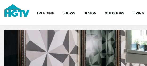
HGTV uses triangular design in a clever way as well. The isosceles triangle sits across the top of their wordmark, a clear but simple way to illustrate the roof of a home. The “V” at the other end of the logo makes a great counterbalance as it points downward.
Quadrilaterals
Quadrilaterals include any four-sided shape. Squares and rectangles are the most common examples, but trapezoids, diamonds, and a few more are included here as well. Squares and rectangles are often symbols of stability and steadiness, conformity, or straightforwardness. Their right angles visually suggest rationality, order, and structure.
Squares and rectangles are often used by brands that want to come across as down-to-earth or pragmatic. From National Geographic to LinkedIn to Dominos, squares and rectangles are common—especially for logos—across a wide range of industries.
Other types of quadrilaterals will also convey those feelings of regularity, but with a more avant-garde, contemporary visual twist. Diamonds can be used to convey luxury or high-end products because of our unconscious association between the shape and the gemstone. Quadrilaterals like kites and rhombuses are great for hinting at a level of stability without resorting to overused patterns.
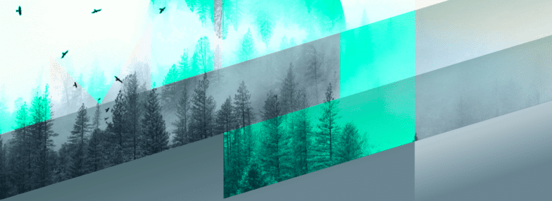
Australian-based web designer Mokthar Saghafi uses a parallelogram shape for the geometric pattern of his website. The four-sided figures are neatly stacked, hinting at the stability usually connoted with four-sided shapes. Setting them slightly off-kilter as a rhombus instead of a true rectangle, though, adds another layer of visual interest.
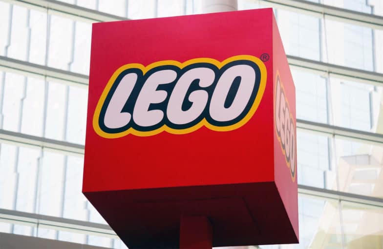
While Lego may not seem down-to-earth or conforming, they’re certainly stable—how else would you build with them? Their square logo is also a visual callback to their product. It looks very remarkably similar to a square Lego brick with four studs.
Polygons
“Polygon” is an umbrella term used to describe any 2D geometric shape, but it’s usually reserved for those with 5 or more sides, like pentagons, hexagons, and octagons.
In nature, these shapes are found everywhere, from honeycombs to shell patterns to crystals and rock formations. In web design, however, they’re used less frequently. This can be a good thing for your clients because it’ll help set you apart from more common design trends!
Complex and futuristic, polygons are often used to create a modern, contemporary aura that’s still well structured. Certain polygons are commonly used within niche industries, however. For example, auto and machine manufacturing and repair companies often employ hexagons and octagons in design as they resemble the head of a bolt.
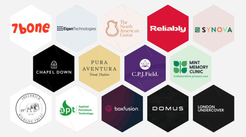
The hexagonal layout used by UK web design agency Built By Buffalo is a great way to show lots of examples of their work upfront without it overwhelming their homepage. It’s then used throughout the website to showcase team headshots, show off fun office photos, and call out important information.
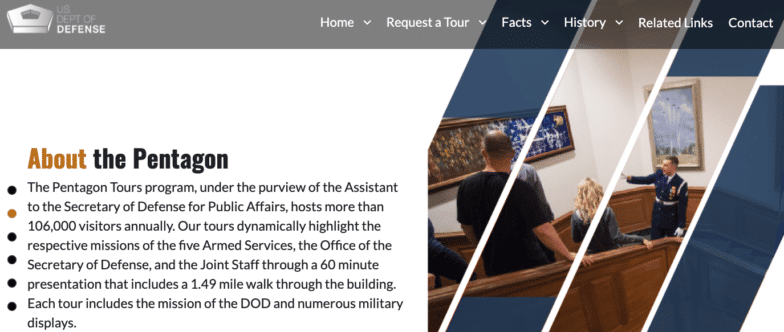
The Pentagon is one of the most recognizable buildings in the world, and it is aptly named for its five-sided structure. A prime example of using polygons for architectural design, the building itself conveys stoicism and stability
Abstract Shapes
There are a few other geometric and abstract shapes that are commonly used across web and product designs, promotions, and branding efforts. Let’s take a quick overview of some of those popular shapes and their meanings.
Blobs
Blobs are often shapes that are characterized as fun or silly. The famous “bouba/kiki effect” has proven that individuals across cultures and writing systems will attribute the nonsense word “bouba” to blob shapes, while “kiki” is associated with spiky abstract shapes.
When you choose to use sharp abstract shapes with spiky edges, you’ll grab the fast attention of your viewer. With rounder shapes, however, you’ll make them feel more comfortable and playful.
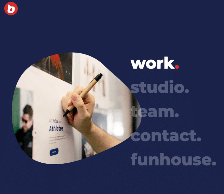
Brooklyn-based custom WordPress design studio Buzzworthy uses lots of blob shapes and bulbous transition animations to showcase their fun, funky style.
Crosses
Often used to showcase spirituality and healing, connection, or balance, crosses appear all the time in web design. It’s the most common way visually to connote a meeting or connection between two things. Another common use for a cross in design is as a “plus” sign, indicating you can add something to a cart or expand for more information.
In logos, crosses are typically reserved for religious organizations due to their strong religious ties, but other, more agnostic uses of the shape have been successful as well.
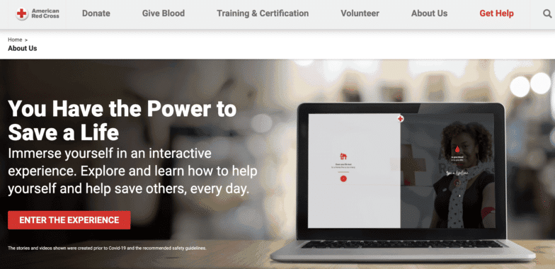
The American Red Cross is one of the most notable organizations to make use of cross imagery. Their work sits at the intersection of individuals who need help and individuals who can help during or after a disaster. The Red Cross’ logo places them at the intersection of those two things, while also visually alluding to healing and health.
Spirals
Spirals connote movement and progression. Rounded spirals and loops often illustrate perfection, beauty, and evolution. If your spiral is more pointed, like a zigzag motion, it’s more likely to convey a pivot, change, or new direction that’s being taken by a product, company, or service.
The direction of your spiral will also have a lot to do with how it’s perceived—especially if you plan on animating it. The last thing you want is to try to convey development, growth, or creativity and end up sending your users on a literal downward spiral. As with most things, convey positive movement by making your spirals move up and to the right when possible.
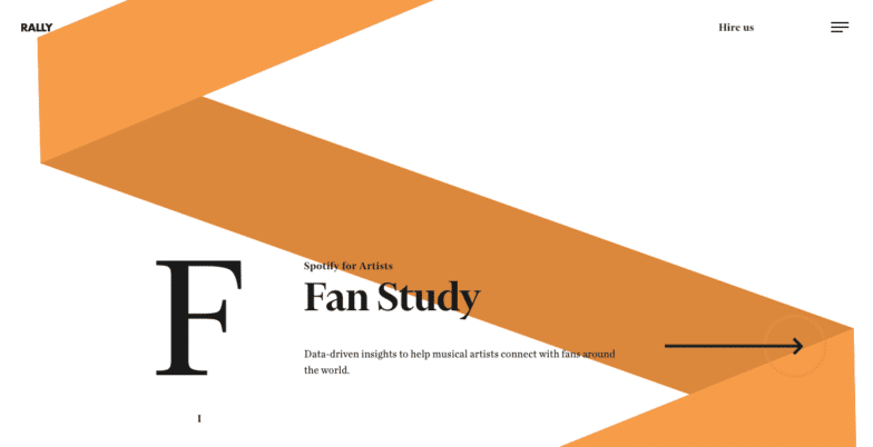
Rally, a digital product studio out of Salt Lake City, UT, uses a simple spiral on a white background for the entirety of their site. The changing colors and dynamic motion of the spiral keep viewers interested visually and create a cohesive user experience.
Organic Shapes
Organic shapes include leaves, branches, roots, waves, stars, clouds, and more. Where geometric shapes can be used together to create images (example: a square with a triangle on top becomes a simple house), organic shapes typically standalone as an image unto themselves.
These shapes will typically be irregular or asymmetrical (but not always) and they’ll have an association with the natural world in some way. The idea of “the cloud” is a perfect use of organic imagery.
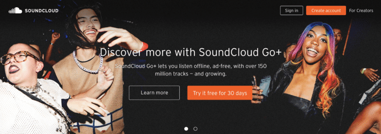
The idea of “cloud” storage ties something very heady and technical—an intangible “location” that holds information—and ties it to the natural world, making it more approachable for tech novices. SoundCloud, for example, is a music sharing site on which users can upload audio files and share them with a growing community of music lovers across the globe.
The Mind Behind Design
As always, these are not hard and fast rules. Use multiple shapes, line weights, and alignments within your design to create visual interest. Using several elements together will allow you to tell a story that your readers can see with their eyes and feel in their gut.
The WP Engine resource center is your source for information on all things design, and our Psychology of Design series is all about using the fundamental elements of design to draw in customers with well-planned branding.
Read parts one and two for a deep dive into the meanings of color and how to use them in your visual storytelling. Then, check out the rest of the series which explores the importance of your typeface, page layout, and logo design.
