How to Change Your WordPress Header Logo
Your logo is your first impression. You probably have it emblazoned on your contracts, in your email signature, and, most importantly, on your website.
It’s become common practice for site owners to prominently display their logo in the top left corner of every page on their site, making it easy for users to identify the website they’re on and navigate back to the homepage of that site by clicking the logo.
Because of this, one of the first things you’ll want to set up after creating a new WordPress site (and implementing your chosen theme) is that top-corner logo.
In this article, you’ll learn about:
The Importance of a Logo for Your WordPress Site
Logos solidify your visual identity for your customers. A good logo sets your brand apart and helps you to build trust with your customers. When a person sees your logo, they’ll think about the quality of your work, products, or services and start to correlate those feelings with the visual aspects of your brand.
Whether you just went through a rebranding process and have a new logo or you’re a new business owner setting up your first website, prominent logo placement is one of the best ways to start building brand recognition with your audience.
Your website is the vessel that will carry the bulk of your brand messaging, so high logo visibility is a great way to tie your message to your visual identity.
How to Change Your WordPress Logo
The process of changing the header logo on your WordPress website will vary slightly depending on the theme you’ve chosen. The inherent flexibility of WordPress means your process may look different than another site owner with different digital architecture, but the basic steps will still look similar.
The following are some quick and easy steps you can take that will help you change your logo for most WordPress environments, including a standard WordPress theme, a non-standard WordPress theme, and a custom WordPress theme.
Note: Remember to always create a backup of your site and use a local development tool, like Local, before making widespread changes to your WordPress site.
Changing a Logo on a Standard WordPress Theme
For most standard WordPress themes, you’ll be able to follow these steps to change your header logo.
1. Log into your WordPress Admin.
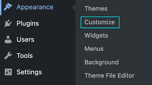
2. Click Appearance > Customize.

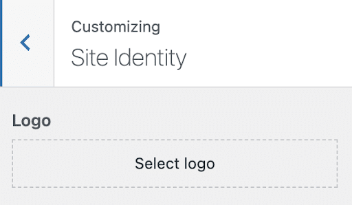
3. Click Site Identity

4. Click Select Logo or, if you already have a logo in place, click Change Logo.
5. Upload your logo file to the media library with a transparent background or choose a preexisting logo file from the library. At this stage, you may be prompted to crop your image, but you can always press “Skip Cropping” if you prefer to keep the image in its entirety
6. Save your changes and publish to see your new logo!

Changing the Logo on a Non-standard WordPress Theme
If the steps above don’t work for the theme you’ve chosen, the best path forward is simply to search “How to change logo for [your selected theme]” using your favorite search engine.
Most well-documented themes will have plenty of information available to help you change your WordPress header logo—either directly from the theme creators or from other members of the WordPress community.
Changing the Logo on a Custom WordPress Theme
If you’re working with a custom-built theme, it’s especially vital to start this process by making a backup and trying your changes in a local development environment before deploying your changes live.
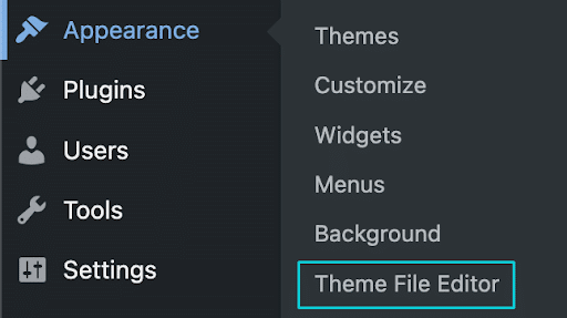
Start by uploading your logo file with a transparent background to the media library. Then access the theme’s code by navigating to Appearance > Editor.

Once you’re in the editor, locate the header file. Typically it’ll be named header.php or something similar. Within the file, identify the code that displays your logo. This will typically look like a small piece of HTML ending in .img.
Now, grab the URL of your new logo file from the media library and replace the ‘src” attribute with that URL. Save your changes and check your homepage as well as a few of your interior pages to ensure the logo looks and fits well within the confines of your custom theme.
If the logo looks as you intended, go ahead and make these changes on your live site. If not, you may consider hiring a WordPress developer to help you work through these changes.
Common WordPress Logo Sizes
So, you’re ready to change your logo, you have a file with a transparent background ready to go, and you’re about to export the file. All you’re left to wonder is: What are the common WordPress logo sizes?
The good news is, there is no hard and fast answer to this question. In general, you’ll want to ensure your logo file is large enough to be legible, especially if your logo employs the use of one or more words, but isn’t so large that it affects, moves, or shifts other elements of your site.
The size required for your WordPress logo will likely depend on the shape of your logo and your theme, so check your theme’s documentation for specifics regarding what will look best for the sites using it.
For a good starting point, try sizing square, triangular, or circular logos to 160×160 px and rectangular logos at 200×100 px. Publish the changes in a local environment to see how they look, and make any necessary tweaks to your sizing from there.
Tips for Creating a Great Logo
There is no wrong or right way to create a logo. Whether you’re working with an internal design team or you’ve hired an agency to help with your branding, there are a few ways to ensure your logo looks great and resonates with your intended audience.
First, take a look at what others in your industry are doing. This will give you a good idea of what’s standard, where you can create similarities between you and your competitors, and where you can make intentional changes to help you stand out.
You want to make sure your logo tells an accurate story for your business, but a logo that’s too similar to or too different from others will either make you blend in too much or stick out like a sore thumb.
One area where you can infuse small similarities with others in your industry is through your color palette. For example, many healthcare logos choose a medium to dark shade of blue, because blue can convey trustworthiness and reliability. Choose your color palette carefully to make sure you’re sending the message you want your audience to receive.
Once you have a general design idea, check your logo using the “squint test.” Resize the logo you’re considering down to the smallest size you plan to use (for example, the size of the logo you plan to use in your website header). If you squint your eyes, can you still recognize the logo at that size? If so, you’re probably doing a good job. If not, consider reducing the amount of elements and simplifying your design to ensure it’s readable no matter where it’s displayed.
Once your logo passes the squint test, you might also consider putting together a focus group to assess your logo. These groups should include both people familiar with your company’s mission and those who are not.
Does each group get a similar feeling when they’re perceiving your logo? Are their reactions extremely dissimilar? Your logo should unify your audience’s feelings about your brand, so make sure it’s making a clear statement.
Make a Visual Statement With Your WordPress Header Logo
Hopefully, this guide will help you use your logo effectively to build your visual identity across every page of your website.
You can visit our Resource Center for additional articles that will help you create and implement a beautiful logo across all your sites! Here are a few to get you started:
Inspiration for Your Next Logo
How to Explain the Importance of Logo Design
Use CSS Sprites to Make Your Logo Responsive


